
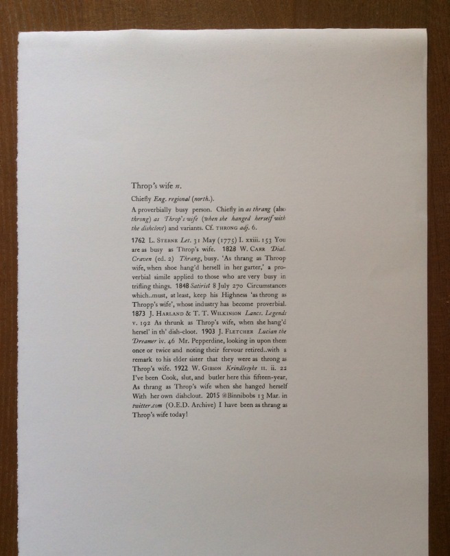
Having set and printed a poem during my letterpress course, I next wanted to try something more challenging. A dictionary entry seemed perfect as it is justified and contains different fonts.
One of the first things I discovered was that there was no bold Caslon, the typeface I was using, so I needed some other way to make the dates, which marked the start of a new quotation, stand out. In the end the instructor found a Gill typeface for me to use. It turns out that bold wasn’t used much before the 19th century and first became popular with dictionary makers for whom space is at a premium.
The entry I chose to typeset doesn’t yet appear in the OED, as I wanted to print something which hadn’t been published before. I also liked the contrast of a 21st-century tweet rendered with the technology of the past.

One of the few Gaelic (Scottish) phrases I know is:tha mi trang. Means I am busy. You say it with a bit of a sigh and a shake of the head when you meet people and they ask you how you are.
Cx
LikeLike
I can imagine saying that at the moment! Apparently Throp’s wife’s trouble was of her own making as she tried to bake, brew, and do the laundry all on the same day.
LikeLike
It looks great Eleanor.
I’ve literally never heard that expression before!
LikeLike